


.png)
I led the redesign of a fragmented business-banking platform used by millions of customers across 300+ U.S. financial institutions, transforming high-risk, error-prone money-movement workflows into decision-driven, scalable systems. The work reduced completion time, lowered abandonment, and established a foundation for future AI-assisted payments and administration.
Impact includes:
.png)
Designing for the Future: AI Integration
I led the redesign with a forward-thinking approach- improving immediate usability while intentionally architecting the experience to support future AI-driven guidance. We moved from a dense, single-page form to a guided, step-based flow, reducing cognitive load, enabling validation at critical checkpoints, and aligning with how users approach high-risk financial actions: one decision at a time.
By introducing lightweight conversational patterns in the early steps, I simplified complex workflows and created a structure capable of supporting predictive, context-aware prompts in the future, such as, “You usually pay your electric bill on the 1st via transfer. Would you like to send it now?
Takeaway:
This work established a scalable, decision-centered framework for business-banking payments—one that supports regulatory complexity today while enabling AI-assisted guidance tomorrow. It demonstrates how intentional UX architecture can reduce risk, improve clarity, and create long-term product leverage across teams and platforms.
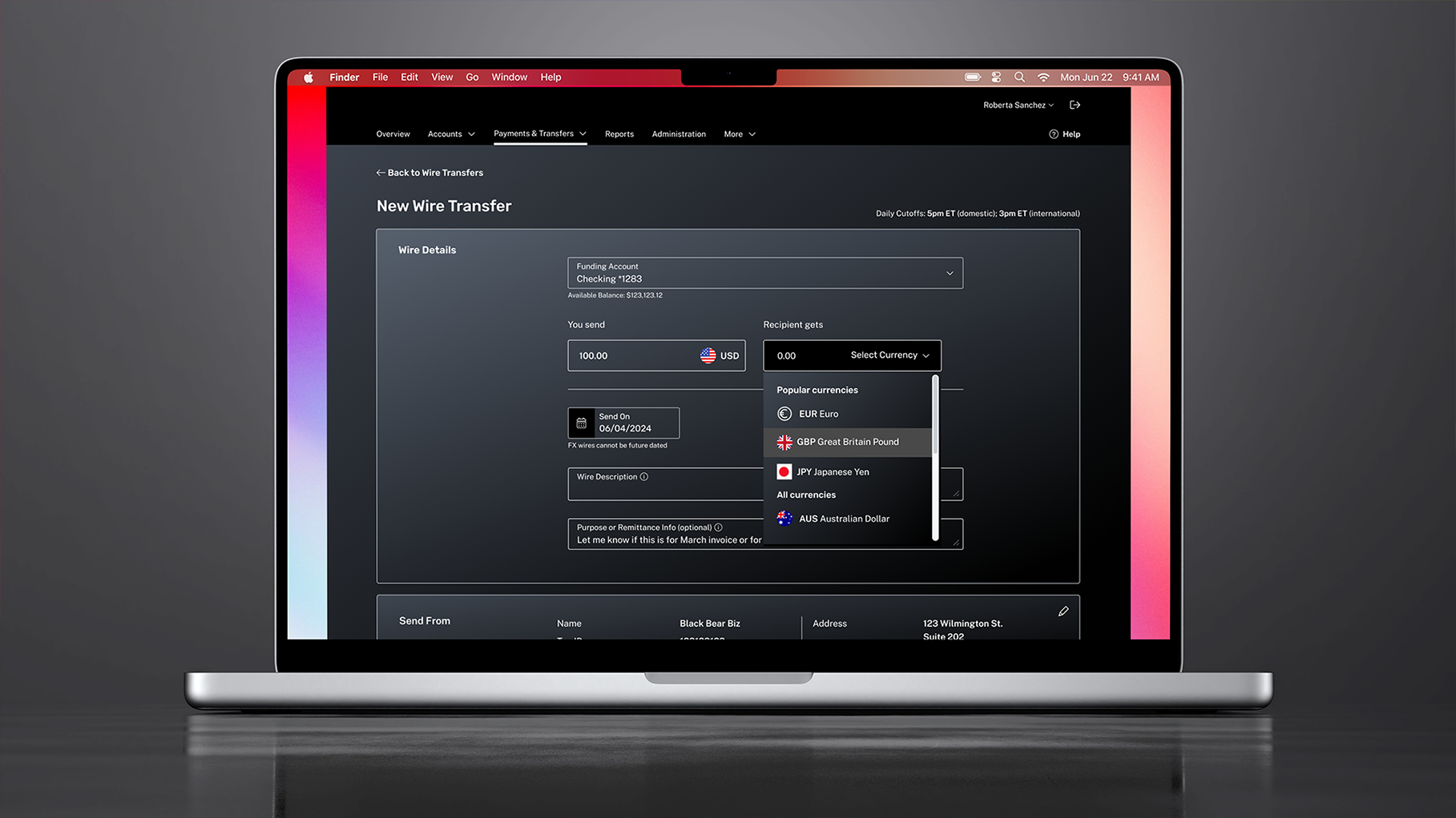
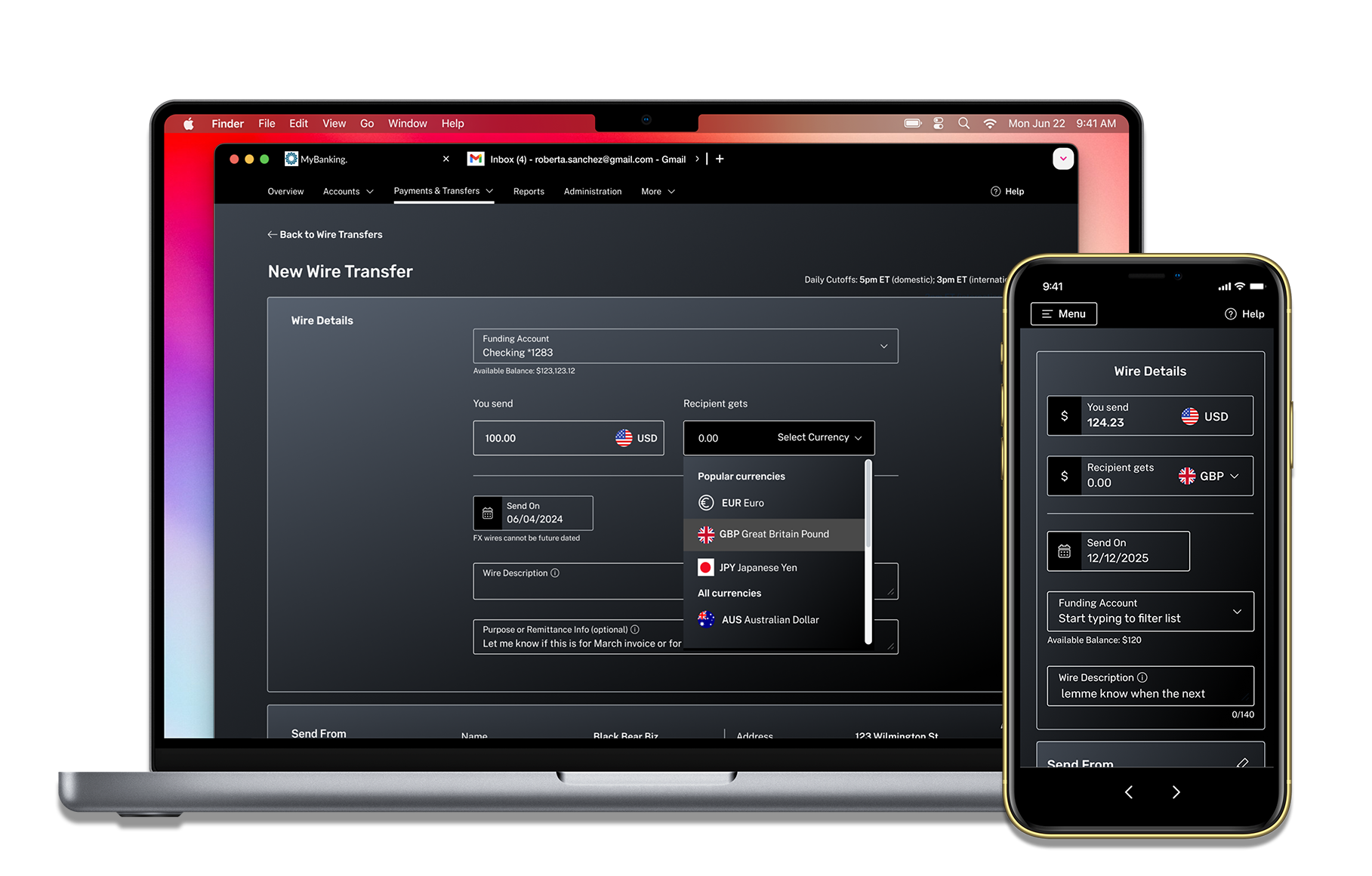
A/B Testing: Wire Transfer Redesign
Wire transfers were previously delivered as dense, single-page forms with dozens of inputs, creating high cognitive load, frequent validation errors, and measurable drop-off—particularly for infrequent users completing high-risk transactions.
To validate the redesign, we ran an A/B test comparing the legacy experience (A) against the new guided, step-based flow (B), measuring completion time, error rate, satisfaction, abandonment, and conversion.
Version B outperformed the legacy design across all metrics, confirming that a decision-driven, progressive flow significantly improved usability and user confidence in high-stakes financial workflows.

Takeaway:
This work established a scalable, decision-centered framework for business-banking payments—one that supports regulatory complexity today while enabling AI-assisted guidance tomorrow. It demonstrates how intentional UX architecture can reduce risk, improve clarity, and create long-term product leverage across teams and platforms.

Research-Driven Design
To ensure the platform remained competitive, usable, and aligned with real business needs, I grounded design decisions in a combination of qualitative and quantitative research. Each input directly informed how complexity was reduced, workflows were sequenced, and features were prioritized.
• AI & fintech trend analysis – Evaluated how predictive analytics, automation, and conversational patterns are being applied across financial products to inform future-ready interaction models without over-automating critical decisions.
• Sales insights – Surveyed and interviewed the sales team to identify breakdowns in product demos, common objections, and features that created friction or failed to convert during client evaluations.
• Quantitative analysis – Used Pendo to identify drop-off points, time-on-task issues, and error patterns within key money-movement workflows, helping prioritize where design intervention would have the greatest impact.
• User testing – Facilitated live focus groups with banking clients to validate interaction models, language, and flow sequencing in real time—ensuring designs aligned with user mental models and regulatory expectations.
Takeaway:
Research wasn’t used to validate aesthetics, but to shape decision structures, reduce risk, and align product behavior with real user and business constraints.
Managing Business Banking Complexity
Operating in the middle of business banking meant balancing regulatory constraints, technical realities, and real user behavior—often with competing priorities across teams.
Each design decision required careful tradeoffs: simplifying workflows without masking risk, aligning experiences across fragmented systems, and meeting business requirements without increasing cognitive load for users.
I focused on reducing friction where it mattered most, standardizing patterns across complex payment types, and creating clarity within unavoidable constraints—so users could complete high-stakes financial tasks confidently and efficiently.

Partnered with the design system team to use scalable components & design tokens, logging any bespoke components I designed.
Improved accessibility by incorporating WCAG-compliant features like high-contrast states.

Made everything responsive, prioritizing mobile web usability and maintaining parity with the native app.
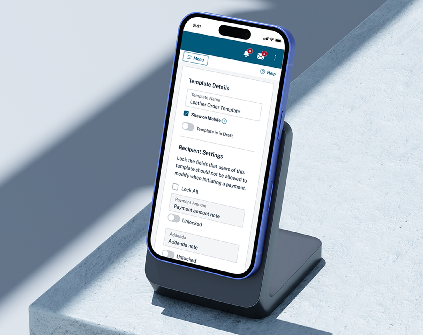
Close-up of some requirements for ACH templates


User permissions (ex: template editors locking fields for template viewers).
API call timing (ex what point should an FX wire interaction lock in a currency rate, or expire).
Varying scenarios based on user entitlements, accounting for all different outcomes of an interaction.
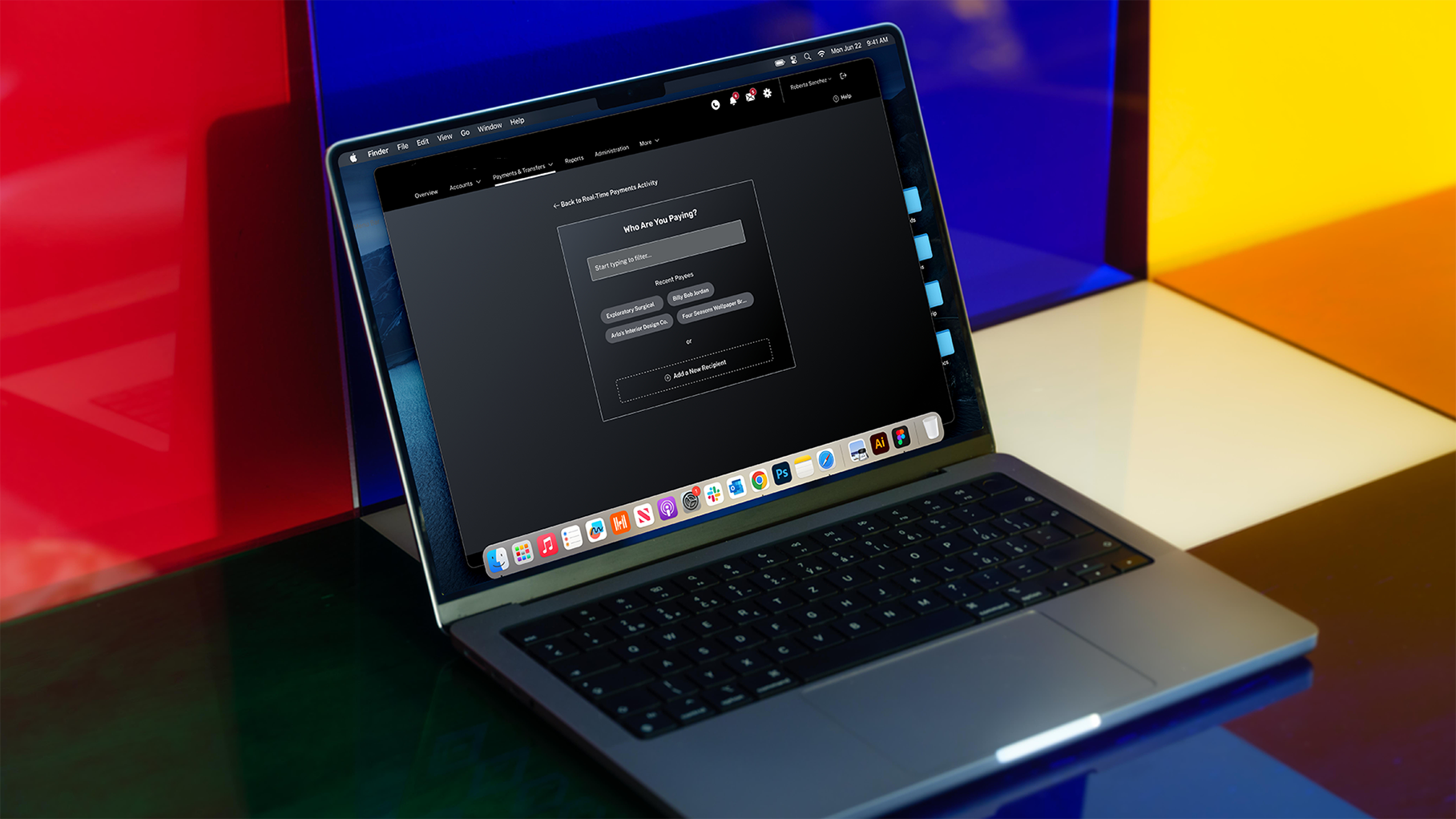
Unlike Wires and ACH, which were constrained by legacy patterns and required incremental improvement, Real-Time Payments (RtP) was a net-new capability— offering the opportunity to design a modern, streamlined experience from the ground up.
Grounded in user research, I drew inspiration from familiar consumer payment platforms such as Venmo and Zelle, ensuring RtP felt intuitive, fast, and immediately understandable for users already accustomed to real-time transactions, while still meeting the rigor of business banking.
Key design decisions included:
Narrower layout to reinforce immediacy
RtP introduced a visually distinct, simplified interface to emphasize speed and clarity. I intentionally moved away from the standard 1260px container in favor of a narrower Tailwind-based layout already used in our digital account-opening platform.
This reinforced the “instant” nature of RtP while minimizing development lift by reusing an established framework.
Image: The original full-width approach was tested and intentionally scrapped.


Mobile-first responsiveness
Because real-time payments often occur on the go, the experience was designed mobile-first for web, ensuring usability even when users were not in the native app.
The design accounted for a wide range of users, from rural business owners sending time-sensitive payments to mobile-native sellers accepting funds in fast-paced environments.
Recent Payees for fast action
To reduce friction, I introduced a “Recent Payees” pattern that surfaced commonly used recipients as tappable chips—eliminating repetitive dropdown searches and enabling faster, more confident task completion.

Real-Time Payments required close coordination across multiple teams. To ensure design decisions were feasible, aligned, and delivered on time, I:

• Held weekly desk-checks with developers to validate feasibility and preserve design intent.
• Led recurring grooming sessions to resolve UX questions in real time.
• Made deliberate scope-aware design adjustments to avoid delivery risk
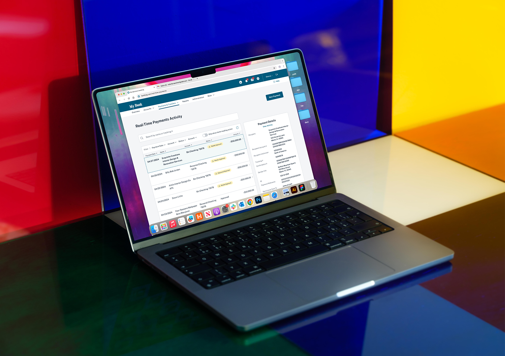
When messaging was removed from the roadmap, I repurposed its unused sidebar into a payment-details slide-out—maintaining critical context for users without introducing new layouts or technical overhead.

Messaging functionality removed from initial scope
Initial messaging sidebar, later repurposed to payment details slide
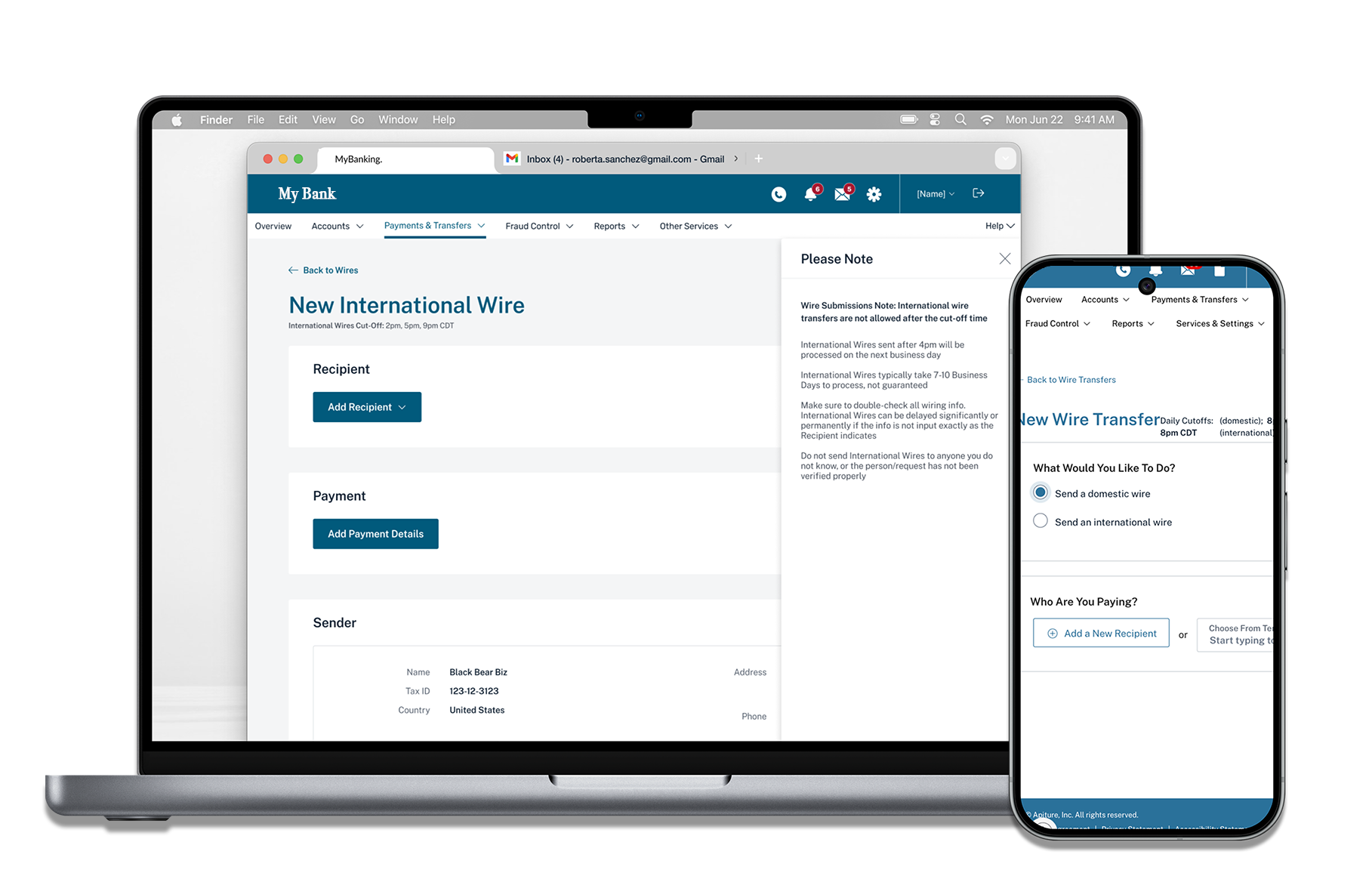
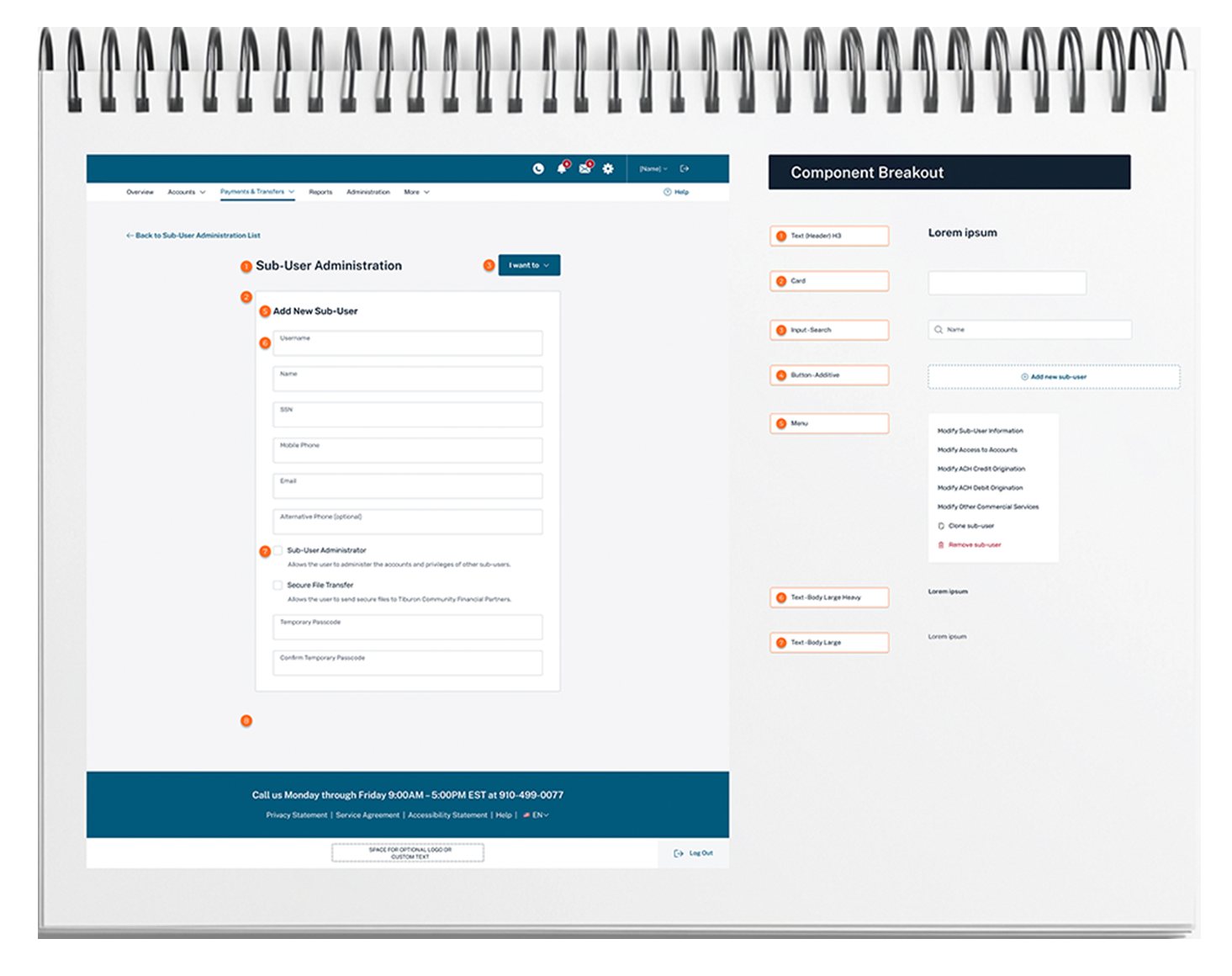
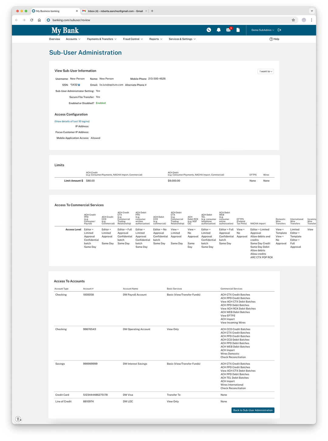
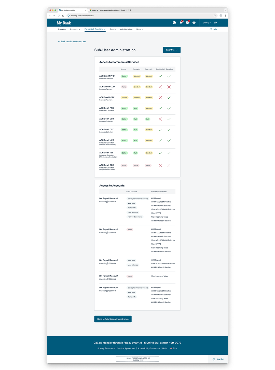
A major 2025 initiative focused on overhauling the internal-facing Sub-User Administration tool- an experience stakeholders described as “a multi-step process with poor layout, overlapping fields, and a UX so confusing that sales avoided demoing it or hid features to make it appear cleaner.”
I proposed and led the redesign of a more intelligent, scalable administration experience, introducing AI-assisted patterns while prioritizing safety, clarity, and control. Key Design Contributions:
System-level mapping and risk identification
I mapped existing role and permission logic to identify conflict patterns, unsafe combinations, and areas where complexity created risk for both administrators and end users.
AI-assisted bulk editing with guardrails
I designed a bulk-editing workflow supported by guardrails that proactively flagged risky permission combinations—allowing admins to move faster without compromising security or compliance.
Technical and data collaboration
I partnered closely with engineering to define edge cases, data constraints, and scalable logic—ensuring the design could support future growth without introducing brittle rules or one-off logic.
UI simplification within constraints
Using design tokens and existing frameworks, I eliminated horizontal scrolling, established a clear vertical hierarchy, and streamlined permission flows—improving scannability while minimizing development overhead.
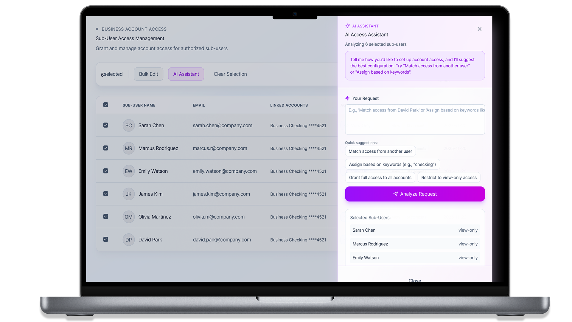
Takeaway
This redesign transformed a high-risk internal tool into a scalable administration system—reducing setup time, lowering cognitive load, and restoring confidence for both administrators and sales teams, while establishing a foundation for safe, AI-assisted permission management.

This case study reflects my approach to designing complex financial systems: simplify where possible, guide decisions where necessary, and architect experiences that scale. By combining research, data, and cross-functional collaboration, I reduced friction, improved usability, and laid the groundwork for safe, AI-enabled growth across business banking platforms.