


.png)
Impact includes:
My Role: Senior Product Designer
I inherited a fragmented business banking platform used by millions of customers across 300+ banks, and transformed it into a scalable experience through data-driven design & cross-functional collaboration,
while setting the stage for AI-driven automation.


.png)
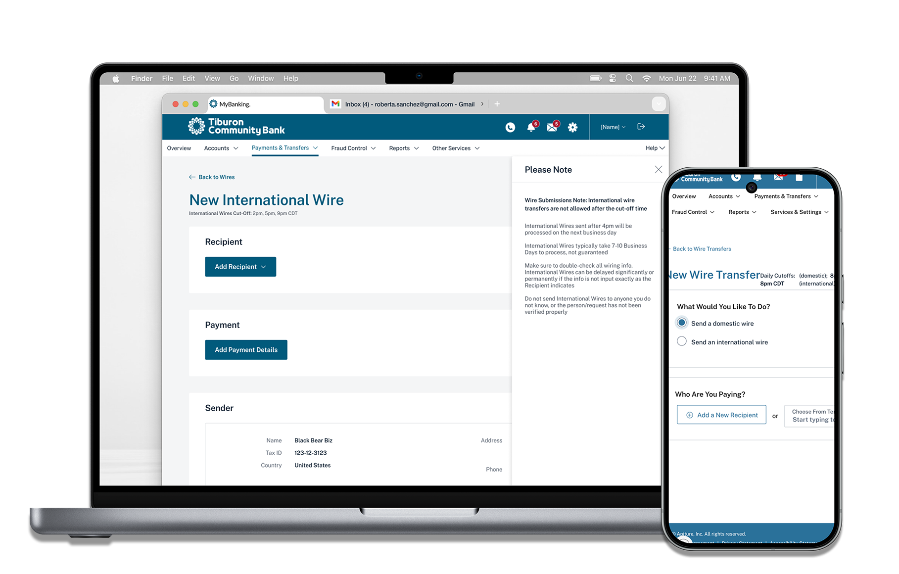
Designing for the Future: AI Integration
I led the redesign with a forward-thinking approach—enhancing current usability while laying the foundation for AI-driven experiences.
By introducing conversational flows, I simplified complex workflows and set the structure for predictive prompts like “You usually pay your electric bill on the 1st via RTP. Send a payment now?”
Takeaway:
These updates improved clarity and usability today while setting the stage for scalable, AI-driven workflows tomorrow.
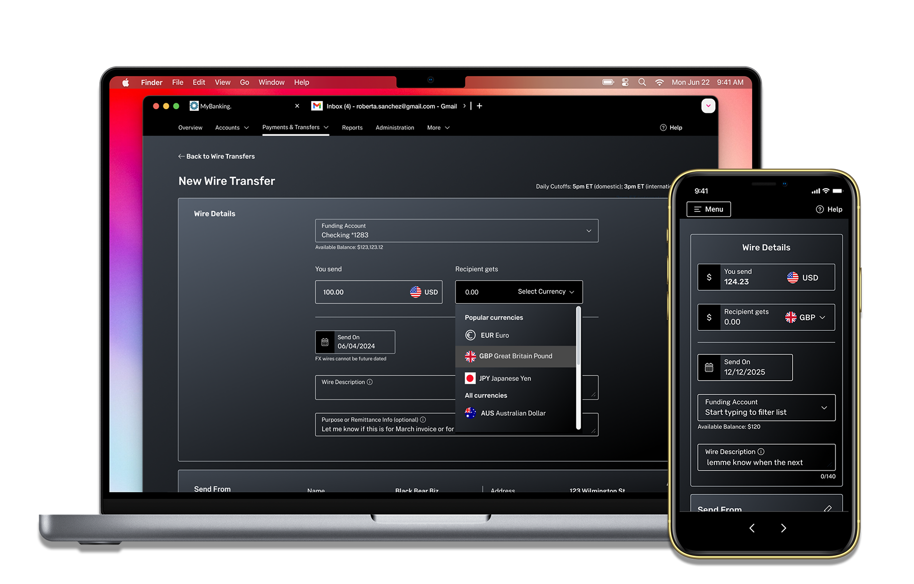
A/B Testing: Wire Transfer Redesign
Comparing the legacy design (A) to the redesign (B), measuring completion time, error rate, satisfaction, abandonment, and conversion. Version B outperformed A across all metrics, delivering a faster, more intuitive user experience.
Takeaway:
The redesign validated measurable UX impact and reinforced a data-driven approach to future iterations.


Research-Driven Design
To ensure the product stayed competitive and user-friendly, I grounded every design decision in research. This included:
• AI & fintech trend analysis – Studied how predictive analytics, automation, and conversational UIs could enhance online banking.
• Sales insights – Surveyed the sales team to identify weak spots in product demos and features that failed to convert.
• Quantitative analysis – Used Pendo to identify drop-off points and optimize key workflows.
• User testing – Ran focus groups with banking clients to validate designs in real time.
Managing Business Banking Complexity
Each design decision had to account for technical, regulatory, and usability requirements. I simplified where possible, aligning UX across complex systems while reducing friction and tackling business reqs.


Partnered with the design system team to use scalable components & design tokens, logging any bespoke components I designed.
Improved accessibility by incorporating WCAG-compliant features like high-contrast states.
Made everything responsive, prioritizing mobile web usability and maintaining parity with the native app.


Ticket requirements for ACH templates... the horror!
Close-up of a few requirements for ACH templates


User permissions (e.g., template editors locking fields for template viewers).
API call timing (e.g., at what point should an FX wire interaction lock in a currency rate, or expire).
Varying scenarios based on user entitlements, accounting for all different outcomes of an interaction.
Despite these challenges, I unified workflows across platforms, ensuring a scalable system that met business and user needs.

Unlike Wires and ACH, which had legacy constraints and required incremental improvements, Real-Time Payments (RtP) was a new feature that offered an opportunity to design a more modern, streamlined experience.
Based on user research, I drew inspiration from consumer-facing payment platforms like Venmo and Zelle, ensuring that RtP felt intuitive, quick, and familiar to users accustomed to real-time transactions.
Key Decisions Included:
• Narrower breakpoint
RtP featured a simplified, visually distinct interface to reinforce its instant-payment nature. Nixing our standard 1260px wide container and using a narrower Tailwind framework, one that we already used in our digital account opening platform, helped achieve this goal while minimizing dev lift.
Right: Initial full 1260px standard width- scrapped


• Mobile-first responsiveness
Given the nature of Real-Time Payments happening on-the-go, I ensured the design was optimized for mobile web usability in the off-chance someone didn’t have the native app.
This accounted for users ranging from Bill, a 67 year old farmer in rural Iowa needing to send COD for an arrival of livestock, to Reagan, a rising senior at NYU accepting payments from her vintage clothing booth at the Brooklyn Flea.
• Introducing a "Recent Payees" feature
Rather than only having to search a dropdown for past recipients, I added a "Recent Payees" section where the user could quickly access their most recipients through clickable chips.

I worked with multiple teams for Real-Time Payments. To ensure my design decisions were both technically feasible and met necessary business requirements, I:

• Held weekly desk-checks with developers to align on feasibility and design integrity.
• Led weekly grooming sessions to answer UX-related development questions in real-time.
• Made key design adjustments to avoid expanding dev scope. For instance, when messaging was cut from the roadmap, I repurposed its unused sidebar into a payment details slide-out—keeping critical info visible without altering the existing layout or framework.

Messaging functionality removed from initial scope
Initial messaging sidebar, later repurposed to payment details slide
Setting the stage for AI
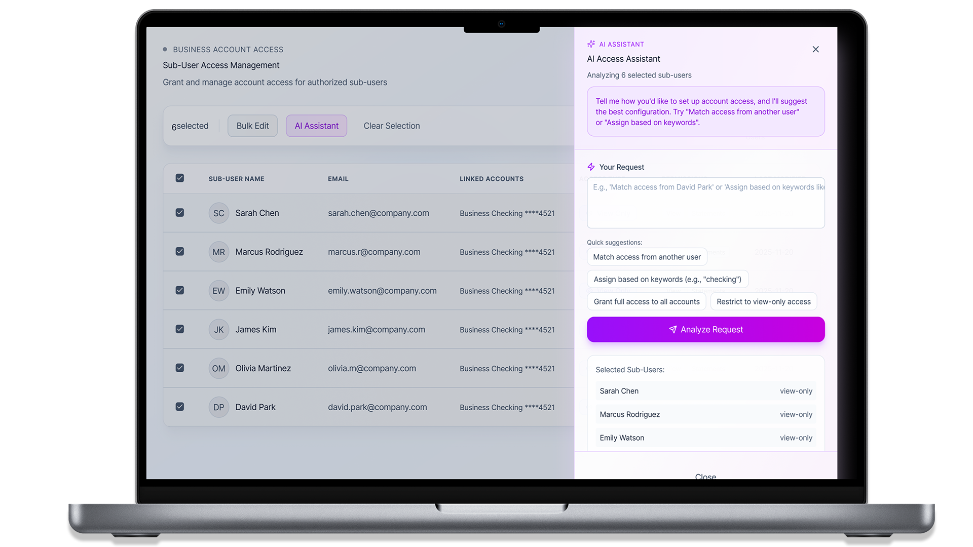
One major 2025 initiative was overhauling the internal-facing Sub-User Admin tool, which stakeholders described as:
"A multi-step process with poor layout, overlapping fields, and a bad UX—sales avoids demoing it, or hides features to make it appear cleaner.”
I proactively proposed and led new feature design of an AI-driven workflow. I:
- Mapped existing role/permission logic and identified conflict patterns.
- Designed a bulk-editing workflow with guardrails that flagged unsafe combinations.
- Partnered with engineering to define edge cases, data constraints, and scalable logic.


• Using design tokens to ensure UI consistency and easy dev implementation.
• Eliminating horizontal scroll, replacing it with a clean vertical structure.
• Working within existing frameworks to reduce technical overhead.
•Streamlining permission flows for clarity and efficiency.
